
Care Home Website Design: How We Built Tower Residential Care's Website
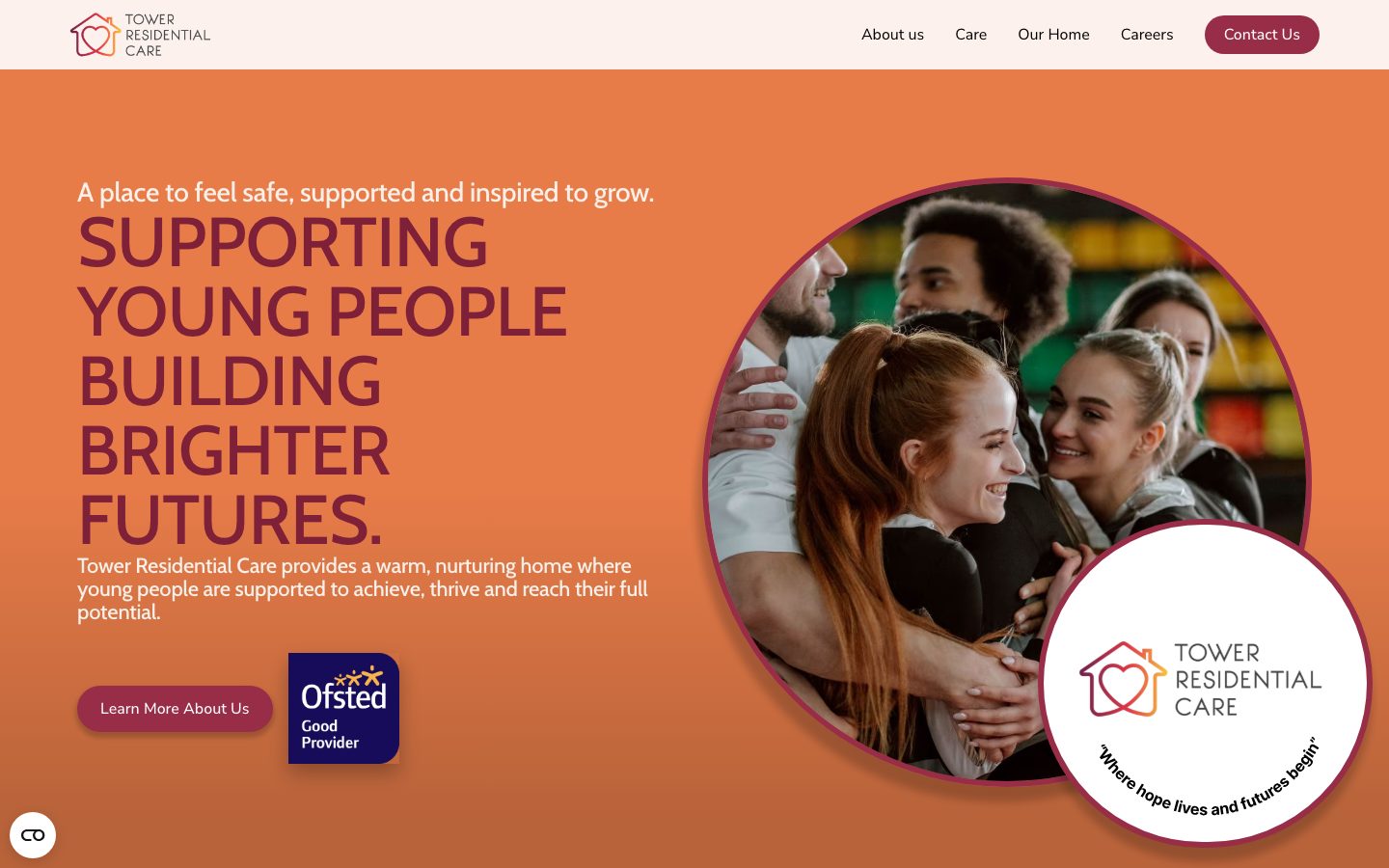
A residential care home rarely gets a second first impression. Before a social worker makes a call, or a young person and their family visit, most people have already looked at the website. That single page has to answer a hard question: is this a safe place to live?
That was the brief for Tower Residential Care, a children's residential home providing child-centred care for young people.
This is how we approached care home website design for a provider with two very different audiences, and what we learned along the way.
What makes a good care home website? Two audiences, one website
Care provider websites are read by people in very different situations. The young people and families who may live with or alongside the home need it to feel like a home rather than an institution.
Social workers, independent reviewing officers and local authority commissioners are looking for something else: evidence of professionalism, regulation and outcomes.
Research before design
The best projects start with research. That means reviewing how comparable homes present themselves, listing the questions families and social workers ask on first contact, and writing down the requirements each audience needs answered.
Short discovery workshops with managers and care staff help bring the unique needs of each audience to the surface early. A day or two of this work saves weeks of revision, because the design team is solving real questions rather than guessing.
Most sites pick one audience and leave the other to guess. For Tower we designed for both on the same page. The tone is warm and plain-spoken, the colour palette is welcoming rather than clinical, and behind that sits clear, structured information about how the home is run.
Our design approach: leading with reassurance for families
The homepage opens with a simple promise: a place to feel safe, supported and inspired to grow. Underneath, a short introduction explains the approach in ordinary language: child-centred care built around stability, trust and positive relationships.
Ofsted registration is stated clearly rather than buried in a footer, because it is one of the first things a professional visitor looks for.
Experience matters more than a glossy brochure
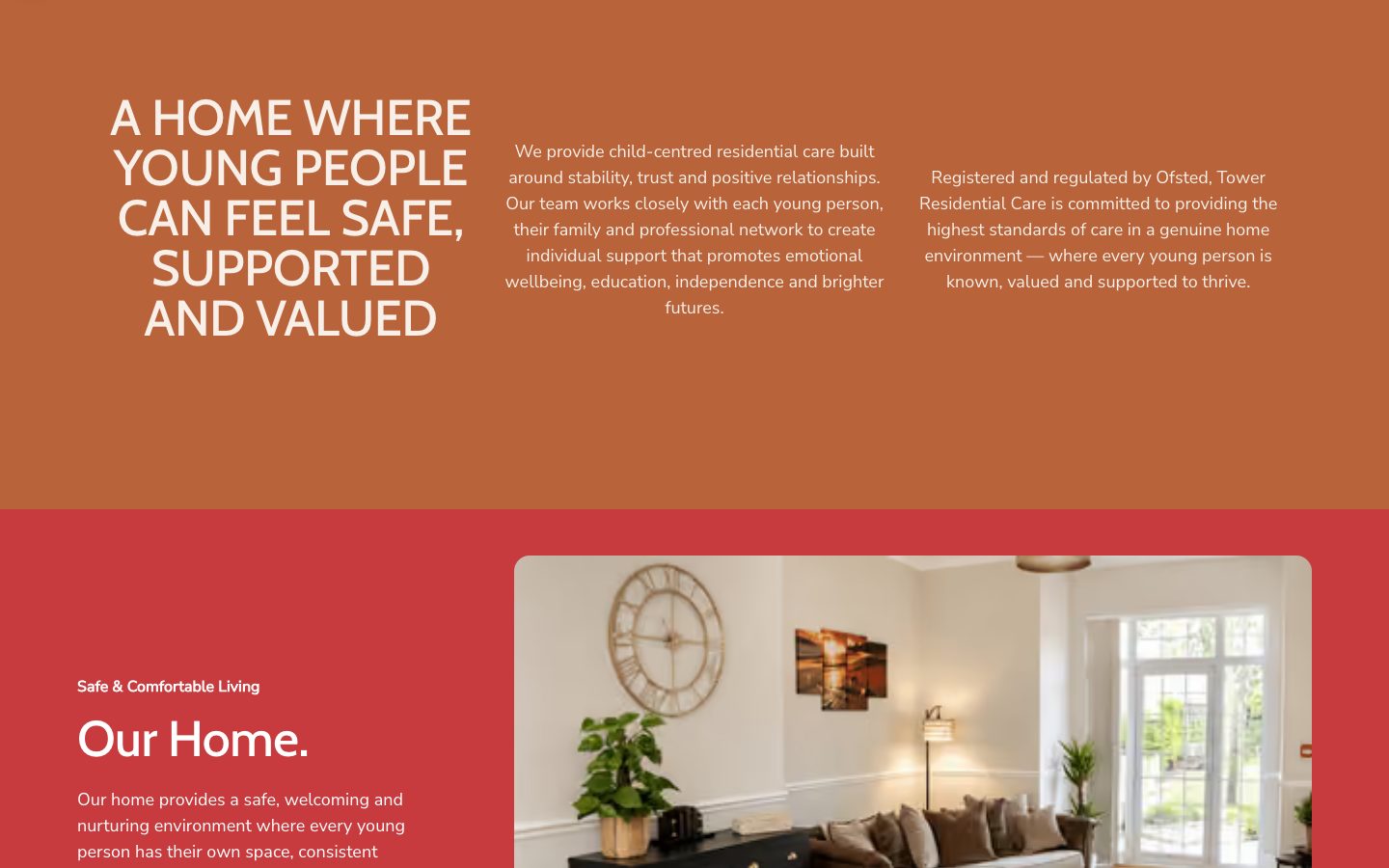
Good care home website design is not a digital brochure. Families want to understand what daily life feels like, so the experience of the site itself matters: calm pacing, plain language and photography that shows real spaces rather than stock images.
Photography does the rest. A real living room, real spaces and a natural, unstaged feel let visitors picture the home before they ever step inside it.
Explaining the care home's approach to residents and families
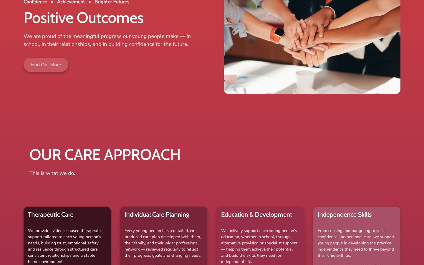
Professionals want detail, but detail can overwhelm. We organised Tower's approach into four clear areas, each with a short explanation and a few bullet points:
- Therapeutic care: trauma-informed, attachment-based support that builds trust and emotional resilience.
- Individual care planning: co-produced plans, developed with the young person, their family and the wider professional network, and reviewed regularly.
- Education and development: school liaison, alternative provision and interest-led learning.
- Independence skills: cooking, budgeting, social confidence and planning for the future.
Evidence over adjectives
Every care provider says it is caring. The stronger signal is what others say about you.
The site includes feedback from professionals who work alongside the home, alongside a summary of what the home does well. It is presented respectfully and without identifying anyone, which is exactly what a safeguarding-conscious audience expects.
Recruitment is part of the brief
A care home is only as good as its team, so the website also has to attract staff. Tower has a dedicated careers page, a clear call to action to view job opportunities, and a Life at Tower video that shows the environment and the people.
It is the same trust-building work, pointed at a different audience.
Care services pages for different types of care
Many providers offer more than one of the main types of care, such as residential care, nursing care, respite stays or dementia care. A single page that tries to cover them all rarely works.
Give each of your care services its own page, so prospective residents and their families can find the answer they are looking for without searching through your site.
Key features of strong services pages
- A plain description of the care and who it suits, including the unique needs your team can support.
- What a typical day looks like, with real photography of real spaces.
- Staffing, training and how the team keeps people safe.
- Regulator information, including your CQC rating where your service is regulated by the Care Quality Commission.
- A clear next step: ring, request a callback or arrange a visit.
If you run several homes, give each home its own page with its own contact details, photographs and inspection information, then link them together from a simple overview.
Families searching for a home near them land on the right page rather than a generic one, and your online presence in search becomes stronger because Google has a clear page for each type of care and each location.
Website design that the home's team can update
Our care home website design for Tower is built in Webflow with a content management system, so Tower's own team can update text, roles and information as the home develops, without waiting for a developer. That matters for a regulated provider whose details need to stay current.
Reliable hosting and regular updates matter too, because families may be searching at short notice and expect the site to be fast and secure.
Accessibility and usability in healthcare websites
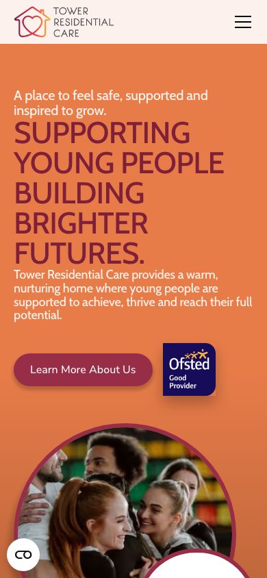
A care home website is visited by people under stress, on phones, often late in the evening. Accessibility and usability should therefore be part of any care home website design brief, not an afterthought.
A good healthcare website meets WCAG 2.2 AA, with strong colour contrast, readable type sizes, clear focus states and a "skip to content" link so keyboard and screen reader users can reach the main content quickly.
Design quality is not only how a site looks. It is accessibility, speed and clarity working together.
Usability matters just as much. Navigation labels should use ordinary words, important actions should sit within one tap of every page, and enquiry forms should be short enough to complete on a phone.
Fewer fields mean more completed enquiries, and a family reaching out for the first time should never feel they are filling in paperwork.
Options for contact without pressure
Visitors should be able to ring, send a short message or request a callback. Offering several options respects the fact that some families want to talk straight away while others need time.
Five care home website design lessons for any provider
- Name your audiences and decide what each one needs to see in the first ten seconds.
- State your regulation up front. Do not make professionals hunt for it.
- Use real photography of real spaces. Stock imagery erodes trust quickly.
- Explain your approach in plain language, then back it with structure.
- Make it editable, so the site keeps up with the service.
You can see the site at towerresidentialcare.co.uk, or read the full Tower Residential Care case study.
Frequently asked questions about care home website design
How much does a care home website cost?
It depends on the number of pages, features such as careers or enquiry systems, and the amount of photography and copywriting needed.
We agree a clear scope and price before starting, so there are no surprises.
What should a good care home website include?
Clear statements of regulation and registration, a plain description of the care approach, real photography, evidence from professionals, simple ways to enquire, and a careers section for recruitment.
It should also be accessible and fast on mobile.
Can our own team update the website?
Yes. We build on a content management system so staff can update text, vacancies and news without a developer.
Do you work with other healthcare and trust-led organisations?
Yes. The same approach suits children's homes, supported living providers, clinics and charities. If trust is the first thing your visitors look for, our web design service is built for that.
Need a website that builds trust before the first call?
We design and build websites for care providers and other trust-led organisations, with a CMS your team can update themselves.